

Lehenga Choli Ideas for Every Body Type and Budget: Your Complete Inspiration Guide
August 11, 2026You find the perfect lehenga on Instagram. The embroidery is beautiful, the silhouette is exactly what you wanted, and the color looks dreamy on the model.
Then you try a similar shade yourself and something feels wrong.
Maybe it makes your skin look dull. Maybe it looks too pale under indoor lighting. Or perhaps it simply does not feel bridal enough when you see it in person.
That is where choosing a bridal lehenga color gets tricky.
In 2026, brides have far more options than traditional red and maroon. Soft greens, muted pinks, jewel tones, earthy shades, and modern neutrals are all finding their place in bridal wardrobes. More choice is exciting, but it can also leave you wondering which color will actually flatter you.
The best bridal color is not simply the shade getting the most likes on Pinterest.
It should flatter your skin, work with your wedding lighting and season, complement your jewelry, photograph beautifully, and most importantly, still feel like you when you look back at your wedding photos years later.
This guide will help you narrow that choice. We will look at the standout lehenga colors shaping bridal looks in 2026, where they work best, and how to style them without losing your own personality.
By the end, you should have a much clearer idea of what to ask for when you walk into your next bridal appointment.
The Top 6 Trending Lehenga Colors of 2026
Bridal color choices in 2026 are becoming softer, more personal, and much less restricted by old rules.
Traditional reds still have their place, but many brides are choosing colors according to their venue, ceremony timing, skin tone, and personal style instead of automatically reaching for one “bridal” shade.
The 2026 color directions highlighted in this guide take inspiration from current South Asian designer collections, bridal fashion reports, and real-wedding styling seen across major wedding platforms. The important thing, though, is not choosing a color simply because it is popular.
Use the trends as a starting point.
Then choose the shade that makes you look your best.
Sage Green: The New Neutral for Daytime Brides

Sage green is one of the easiest colors to love for a daytime wedding.
It is softer than emerald and less traditional than bottle green, which gives it a calm, romantic feel without making the outfit look plain. Under natural daylight, the muted green can look especially beautiful because it works with the surroundings instead of fighting them.
If your wedding has a garden, palace courtyard, outdoor mandap, or lots of greenery, sage fits naturally into the setting.
It also pops beautifully against gold jewelry.
Why Sage Green Works
Sage gives you color without overwhelming your face. That makes it especially useful when your lehenga already has detailed embroidery, sequins, pearls, or metallic work.
It can also be a lovely choice if bright reds and deep jewel tones feel too heavy for your personality.
Organza, tissue, silk, and lightweight embroidered fabrics work particularly well with this shade because they keep its soft character intact.
Best For
Sage green works beautifully for:
- Morning or daytime wedding ceremonies
- Spring and summer weddings
- Garden and outdoor venues
- Mehendi celebrations
- Brides who prefer softer, understated colors
For a morning phera ceremony surrounded by greenery, for example, a sage organza lehenga with fine silver or gold threadwork can look fresh without disappearing into the background.
How to Style a Sage Green Lehenga
Keep the rest of the look soft.
Fresh, dewy makeup works better than very dark eye makeup here. Peach blush, softly defined eyes, and a nude or warm pink lip allow the color of the lehenga to remain light and romantic.
Heavy black kohl can sometimes feel too harsh against muted sage, particularly for a daytime ceremony.
For jewelry, gold is the easiest pairing. Kundan, antique gold, pearls, or subtle polki can all work depending on the embroidery.
You can also introduce a second soft shade through your dupatta or flowers. Blush pink, ivory, champagne, and muted peach sit beautifully beside sage green.
Styling tip: If you are unsure how different shades will look together, use the Adobe Color Wheel to test combinations before finalizing your lehenga, bridesmaid outfits, flowers, and décor. Sage with blush pink and ivory creates a particularly soft wedding palette. Want to see this softer green palette in a finished bridal look? Take a look at Hazel Éclat.
Dusty Rose: Romantic and Easy to Wear

If bright pink feels too sweet but beige feels too quiet, dusty rose sits beautifully in the middle.
It combines muted pink with soft beige undertones, giving you a bridal color that feels romantic without looking overly sugary. It is also one of those shades that can adapt surprisingly well to different skin tones when the undertone and embroidery are chosen carefully.
That versatility is a big part of its appeal.
Dusty rose also photographs beautifully under warm indoor lighting, which makes it especially strong for evening events.
Why Dusty Rose Works
The muted base keeps the color sophisticated, while embroidery can completely change its personality.
Pair it with champagne threadwork and the lehenga feels soft and modern.
Add antique gold zardozi and it becomes richer.
Bring in maroon detailing, and suddenly the same dusty pink feels much more traditionally bridal.
This flexibility makes dusty rose useful if you love modern colors but still want your outfit to have enough depth for a wedding ceremony.
Best For
Dusty rose is especially suited to:
- Evening receptions
- Sangeet nights
- Indoor ceremonies
- Ballroom and hotel weddings
- Brides who want pink without choosing a bright rani or fuchsia shade
Warm lighting helps bring out the pink and gold tones, so the color often looks richer in evening photographs than it does under harsh showroom lights.
Will Dusty Rose Suit Your Skin Tone?
Usually, yes, but the exact shade matters.
If you have warm or wheatish skin and worry that muted pink will look flat, do not give up on it immediately. Look for dusty rose with warmer undertones and enough contrast in the embroidery.
A richer gold border, maroon dupatta edge, or deeper blouse detail can stop the outfit from blending into your complexion.
If you have been saving dusty rose lehengas but worry they will look flat against wheatish skin, here is the trick: add contrast. Gold embroidery and a deeper maroon border can make the whole color come alive.
Give Dusty Rose a More Traditional Bridal Feel
Family wants something more “bridal,” but you still want dusty pink?
You do not have to change the entire lehenga.
Ask your designer to introduce deep maroon, antique gold, or burgundy through the dupatta border, blouse detailing, or embroidery.
That little bit of depth anchors the softer pink and gives the outfit more ceremony without taking away the color you actually love.
Expert tip: Always look at dusty rose embroidery from a few steps away, not only up close. Fine gold zardozi may seem subtle in the fitting room, but under warm wedding lights it can catch the light beautifully and give the lehenga much more dimension.
Midnight Blue: Regal and Dramatic for Evening Affairs

If you want the drama of a deep bridal color but traditional red feels too expected, midnight blue is worth trying.
And midnight blue is not quite the same as regular navy.
It is deeper, moodier, and often has an almost-black finish with subtle blue or purple undertones. Under evening lights, this depth helps the fabric look rich rather than simply dark.
That is exactly why it works so well for grand evening celebrations.
Current bridal collections also continue to feature blue, lilac, and ivory lehengas, including embroidered blue and blue-lilac options in Manish Malhotra’s bridal range.
Why Midnight Blue Works
Midnight blue gives you a strong bridal presence without relying on traditional red or maroon.
The color looks especially beautiful when paired with metallic embroidery. Antique gold makes it warmer and more traditional, while silver, crystal, or diamond-style work gives it a sharper evening feel.
It is also a smart choice if you want your lehenga to look different in different lighting.
In daylight, you see the blue.
Under warm ballroom lighting, it becomes darker and more dramatic.
Best For
Midnight blue works particularly well for:
- Evening wedding ceremonies
- Winter weddings
- Grand receptions
- Ballroom venues
- Cocktail-style wedding events
- Brides who prefer deep colors over pastels
Imagine a midnight blue velvet or raw silk lehenga under chandeliers, finished with gold zardozi and a rich ruby necklace. You get the drama associated with traditional bridal colors, but the overall look feels less predictable.
How to Style a Midnight Blue Lehenga
Do not be afraid of contrast.
Ruby jewelry looks striking against deep blue, especially when there is warm gold embroidery in the lehenga. Emerald jewelry can also work beautifully if you want a more jewel-toned combination.
For makeup, midnight blue can carry more intensity than sage or lavender.
A deep red or berry lip adds warmth and stops the face from getting lost against such a dark outfit. Soft smoky eyes can work too, but balance matters. If both the eyes and lips are very heavy, the final look may feel crowded.
Styling tip: Take at least one flash photograph while trying the lehenga. Very dark blues can look almost black in some photography, so you want to know how the shade behaves before the wedding day.
Lavender: Soft, Fresh, and Made for the Modern Bride

Lavender is no longer limited to mehendi outfits and bridesmaid looks.
It can work beautifully for the main wedding ceremony too, especially if your wedding style is light, airy, and romantic.
The secret is choosing the right lavender.
Current designer bridal ranges continue to use blue-lilac and other soft pastel combinations, showing that this softer color family still has a place in contemporary bridal wear.
Why Lavender Works
Lavender feels softer than blue and cooler than pink.
That makes it a lovely middle ground for brides who want a pastel but do not connect with blush pink, peach, or mint.
It also works naturally with destination settings. Think beach ceremonies, floral mandaps, palace courtyards, and outdoor weddings where heavy jewel tones might feel visually too strong.
Best For
Lavender is a lovely choice for:
- Daytime wedding ceremonies
- Spring and summer weddings
- Beach weddings
- Destination weddings
- Outdoor venues
- Brides who want a soft, romantic color without choosing pink
Light fabrics help this color shine.
Organza, georgette, net, and lighter silks allow lavender to keep its airy feel. Very heavy fabrics can make the shade appear darker and more serious.
Will Lavender Suit Wheatish or Dusky Skin?
Yes, but pay attention to the undertone.
Very pale, icy lavender can sometimes blend too closely with certain complexions. If you have wheatish or dusky skin, try a warmer lilac or a lavender with a little more pink in it.
Then bring warmth back through embroidery.
Gold threadwork, kundan jewelry, warm blush, and a soft rose or nude lip can stop lavender from feeling cold around the face.
Expert tip: Never approve lavender from a phone screen alone. Ask for a fabric swatch and look at it near a window or outdoors. The same lavender can appear completely different on silk, georgette, organza, and net.
Natural light will tell you far more than a heavily edited product photo.
Ivory and Champagne: The Perfect Canvas for Statement Jewelry

If your jewelry is one of the most important parts of your bridal look, ivory and champagne deserve serious consideration.
These shades do not compete for attention.
They create space for your polki, kundan, heirloom gold, emeralds, or statement necklace to stand out.
Ivory is also clearly present in current designer bridal ranges. Anita Dongre currently lists ivory bridal lehenga options alongside sage pieces, while Manish Malhotra’s bridal collection includes several ivory and ivory-based designs.
Why Ivory and Champagne Work
A heavily embroidered ivory lehenga can still look unmistakably bridal.
The difference comes from styling.
Gold embroidery warms it up. A red or maroon dupatta adds tradition. Emerald jewelry gives contrast. Champagne threadwork creates a softer monochrome effect.
This is why ivory is so versatile.
You can take the same base color in several completely different directions.
Best For
Ivory and champagne work well for:
- Wedding ceremonies
- Receptions
- Day or evening events
- Year-round weddings
- Brides wearing heirloom jewelry
- Brides who want the embroidery and jewelry to take center stage
If you are wearing a heavy family polki set or a traditional gold choker, an ivory lehenga can actually help the jewelry look more important because there is less color competing with it.
Worried That Ivory Does Not Look “Bridal Enough”?
This is one of the most common worries with neutral bridal colors.
But bridal does not come from color alone.
A heavily embroidered ivory lehenga, red dupatta, bridal jewelry, mehendi, and full wedding styling will read very differently from a simple ivory occasion outfit. For a closer look at how ivory works with pearls and champagne-gold details, see Ivory Rosette.
If your family still wants a stronger traditional color, use the dupatta as your compromise.
Try ivory with:
- Deep red for a classic bridal contrast
- Maroon for a richer, moodier finish
- Emerald for a royal color combination
- Dusty pink for something softer
- Gold for a monochrome look
Styling tip: If your lehenga and jewelry are both gold-heavy, compare the gold tones before buying. A very yellow gold necklace may clash with pale champagne embroidery, while antique gold can look softer and more connected.
Burnt Rust: Earthy and Unexpected for the Bride Who Wants Something Different

Pastels are not your thing.
Deep jewel tones feel too formal.
And you have already seen enough pink lehengas to last a lifetime.
Burnt rust gives you another direction entirely.
This terracotta-inspired shade sits somewhere between orange, brown, and red. It feels warm, grounded, and especially beautiful in venues with natural textures such as sandstone, old havelis, courtyards, wood, greenery, or marigold décor.
Broader 2026 bridal color coverage is also moving toward more nuanced, less obvious shades rather than relying only on very bright traditional colors, which makes earthy palettes feel especially relevant right now.
Why Burnt Rust Works
Rust has enough warmth to feel festive, but it does not look like another version of bridal red.
That makes it a strong option for someone who wants an Indian bridal color with a more earthy personality.
It also pairs beautifully with marigold yellow, deep green, antique gold, cream, and brown.
Best For
Burnt rust works especially well for:
- Autumn weddings
- Outdoor haveli ceremonies
- Rustic wedding venues
- Mehendi functions
- Intimate daytime weddings
- Brides who prefer warm, earthy colors
For a mehendi or outdoor ceremony, a burnt rust lehenga with antique gold embroidery and marigold flowers can look rich without feeling overly formal.
A Note for Fair Skin
Rust can sometimes pull very orange against fair skin.
If you try it and your face suddenly looks more yellow or flushed, do not assume rust is completely wrong for you.
Try a deeper version with more brown, brick, or muted red in the base.
That small shift can make a major difference.
Cooler makeup can also help balance the warmth. Soft rose blush, neutral eyes, and a brown-rose lip are usually easier than adding more orange and terracotta everywhere. If you like richer earthy combinations, Rangreza shows how burnt orange, crimson, and green can work together.
Expert tip: Rust already has a strong personality. You do not need to repeat the exact same warm orange tone in your makeup, jewelry, flowers, and dupatta. A little contrast keeps the outfit from becoming too one-note.
Skin Tone Matching Guide: Find Your Most Flattering Lehenga Color
Your skin tone matters, but your undertone usually tells you more.
And even then, treat color analysis as guidance rather than a strict rule.
A common starting point is to look at the veins near your wrist. Blue or purple-looking veins are often associated with cooler undertones, while greener-looking veins may suggest warmer undertones.
But this test is not perfect.
Lighting, skin depth, and olive undertones can make veins difficult to read. If you cannot clearly place yourself in warm or cool, you may be neutral or olive.
The most reliable test is still simple: hold the actual fabric near your face in natural light.
Does your skin look brighter?
Do your eyes stand out?
Or does the color make you look grey, yellow, or tired?
That reaction matters more than a label.
| Skin Tone | Colors to Try First | Approach With Caution | Why They Often Work |
| Fair with cool undertones | Dusty rose, lavender, cool pastels, midnight blue, soft ivory | Strong orange, very warm mustard, orange-heavy rust | Cooler pinks, blues, and soft neutrals often sit naturally beside rosy or cool undertones. |
| Fair with warm undertones | Sage green, champagne, peach, soft coral, warm gold | Very icy lavender, stark white, blue-heavy pastels | Warm and softly earthy shades can bring out the golden warmth already present in the skin. |
| Medium or wheatish skin | Sage green, dusty rose, burnt rust, emerald, maroon | Neon shades, extremely pale pastels, flat black | Medium skin can carry a wide range of colors. Rich shades and muted warm tones often provide enough contrast without overpowering the face. |
| Dusky with warm undertones | Midnight blue, emerald, burnt rust, deep maroon, warm ivory | Pale beige, flat grey, very washed-out pink | Rich colors can create beautiful contrast, while deeper warm shades bring definition around the face. |
| Dusky with cool undertones | Midnight blue, plum, wine, charcoal, silver-grey | Bright orange, strong yellow, very warm brown | Deeper cool shades can harmonize beautifully with cooler undertones without adding unwanted warmth. |
What If You Have Olive Undertones?
Olive skin deserves its own mention because it does not always fit neatly into warm or cool categories.
If your skin has a slightly green, golden, or muted quality, try colors with depth.
Emerald, maroon, dusty rose, champagne, sage, plum, and richer ivory shades can all be worth testing.
Very grey pastels may sometimes make olive skin look dull, so compare them with slightly warmer or more saturated versions before deciding.
And remember: none of these are rules.
If a color makes your face light up and you feel good wearing it, that matters more than which category a chart puts you in.
Color Combinations and Styling Tips
Choosing your main lehenga color is only half the decision.
Your dupatta, blouse, jewelry, embroidery, and makeup can either support that color or completely change how it feels.
This is where you can make a trendy shade feel more traditional, make a neutral lehenga feel richer, or add contrast without changing the entire outfit.
The Dupatta: Your Secret Weapon for Color Play

Torn between the color you love and the traditional bridal shade your family keeps suggesting?
Use the dupatta.
It is one of the easiest ways to introduce a second color without giving up your original lehenga choice.
A sage green lehenga with a maroon dupatta instantly feels more bridal.
An ivory lehenga with dusty pink keeps the outfit soft.
Midnight blue with ruby red gives you far more drama.
How to Choose the Right Dupatta Color
Start by looking closely at the embroidery.
Pick one secondary color already present in the lehenga and repeat it in your dupatta.
For example, if your midnight blue lehenga has gold embroidery with small ruby details, a ruby-red dupatta connects naturally with the outfit rather than looking randomly added.
You can use the same idea with:
- Sage green + maroon
- Ivory + red
- Dusty rose + burgundy
- Lavender + champagne
- Burnt rust + deep green
- Midnight blue + ruby
Expert tip: Put the dupatta near your face before finalizing it. Because it frames your face in photographs, its color can affect your complexion even more than the lehenga skirt.
Blouse Colors That Make Your Lehenga Look Better

Do not treat the blouse as an afterthought.
It sits closest to your face, which means its color can have a big effect on the complete bridal look.
If the lehenga color feels slightly flat on you, a contrasting blouse can sometimes fix the problem without changing the skirt at all.
For example, a dusty rose lehenga with the same dusty rose blouse looks soft and coordinated.
Switch that blouse to deep maroon or emerald and suddenly the whole outfit has more definition.
A Simple Way to Choose Your Blouse Color
- Identify the main color of your lehenga.
- Look at the secondary shades in the embroidery.
- Use a color wheel to explore a complementary shade or choose a deeper tone from the same color family.
- Check that the blouse fabric matches the formality of the skirt.
- Hold the blouse fabric near your face before approving it.
Adobe Color can be useful when you are experimenting with combinations.
But do not let a digital color wheel make the final decision for you.
Fabric texture, metallic embroidery, skin tone, and wedding lighting can change how those same colors look in real life.
Jewelry and Makeup: Bring the Whole Color Story Together

Once the lehenga is finalized, stop choosing everything else separately.
Your jewelry, makeup, blouse, dupatta, and lehenga should feel like parts of the same look.
A simple mood board can save you from expensive styling mistakes.
Upload photos of your lehenga, jewelry options, makeup references, flowers, and dupatta into Canva and place them side by side. You will quickly notice if one element feels too warm, too cool, too heavy, or completely disconnected.
Here are some easy starting combinations:
- Sage green lehenga: Gold or kundan jewelry, peach blush, soft eyes, nude or warm pink lips.
- Midnight blue lehenga: Polki, diamonds, ruby, or emerald accents with a red or berry lip. Keep smoky eyes controlled if the jewelry is already very heavy.
- Ivory lehenga: Gold, polki, or kundan jewelry with soft pink makeup and a glossy neutral lip. Add red through the dupatta if you want more traditional contrast.
- Burnt rust lehenga: Antique gold or oxidized silver can both work depending on the embroidery. Try warm terracotta or rose-brown makeup with a neutral brown lip.
- Dusty rose lehenga: Antique gold, polki, pearls, or emerald accents pair beautifully. Keep the makeup slightly warmer if the pink has beige undertones.
- Lavender lehenga: Diamonds, pearls, champagne gold, or subtle kundan can work well. Rose, mauve, or warm nude makeup stops the color from feeling too cool.
Test Everything Before the Wedding Day
This final step is easy to skip.
Do not.
Wear your blouse or hold your lehenga fabric near your face with your planned jewelry and makeup.
Check yourself in:
- Natural daylight
- Warm indoor lighting
- Phone camera photos
- Flash photography
- Video
What looks beautiful in a mirror can lose contrast in photographs.
And what looks slightly bold in person may photograph perfectly.
Your goal is not to choose the “correct” bridal color.
It is to find the shade that flatters your skin, works with your setting, photographs beautifully, and still feels completely like you.
Fabric and Embroidery Impact on Lehenga Color
You can choose the perfect shade and still be surprised when your lehenga arrives.
Why?
Because color does not exist separately from fabric.
The same lavender can look soft and powdery in georgette, crisp and cool in organza, and much richer in velvet. Embroidery changes it again by adding shine, contrast, texture, and reflected light.
This is one reason a lehenga color you loved online may look completely different when you see it in a boutique.
It is also why you should never finalize an expensive bridal lehenga from a digital color reference alone.
Bridal designers regularly work across fabrics such as silk, organza, velvet, and brocade, often combining them with zardozi, tilla, and other surface work. Sabyasachi’s current Heritage Bridal collection, for example, specifically features matka silks, organzas, velvets, brocades, and traditional embroidery techniques.
How Fabric Changes the Game
Velvet: Deeper, Richer and More Dramatic

Velvet makes color feel deeper.
Its raised pile interacts with light differently depending on the direction of the fibers, which is why velvet can appear darker in one area and more luminous in another. This creates the depth and shading we associate with the fabric.
A midnight blue velvet lehenga, for example, may look almost black in a dim ballroom. Once the light hits it, however, the blue starts to show.
Burnt rust becomes richer too, moving closer to deep terracotta or brown-red depending on the lighting.
Velvet is especially useful when you want a strong evening look or are dressing for a cooler winter celebration.
Keep in mind: If retaining the exact color matters to you, photograph dark velvet under both natural light and the type of artificial lighting planned for your venue.
Raw Silk and Banarasi: Color With Natural Shine

Silk gives color more life.
Instead of looking completely flat, the surface catches light as you move. That can make a muted shade appear stronger than it would on a matte fabric.
A dusty rose raw silk lehenga may therefore feel richer and more defined than the same dusty rose on lightweight georgette.
This is one reason silk works so naturally for wedding ceremonies. It gives softer colors enough presence to still feel special.
It also works beautifully with traditional embroidery and heavier jewelry.
Styling tip: If you love a muted bridal color but worry that it feels too quiet, try the shade in silk before moving to a darker color. Sometimes the fabric gives you all the richness you were missing.
Georgette and Chiffon: Soft and Airy

Want your color to feel lighter?
Try it in georgette or chiffon.
These fabrics are light and fluid, so they usually create a softer overall impression than a heavy, structured fabric.
A sage green georgette lehenga, for example, can feel delicate and romantic rather than strongly green.
This makes lighter fabrics especially attractive for daytime weddings, destination events, and brides who want movement rather than a very structured skirt.
They can also make deeper colors feel less visually heavy.
Keep in mind: Layers matter. A sheer outer fabric placed over a colored lining can change the final shade considerably, so always check the complete fabric combination rather than the top layer alone.
Organza: Crisp, Sheer and Light-Catching

Organza can completely change a pastel.
It is lightweight and sheer like some softer bridal fabrics, but it has a much crisper structure and often a lustrous finish.
That combination can make colors feel clean, bright, and slightly cooler.
Lavender organza, for instance, may look more icy and delicate than lavender raw silk.
Sage, blush, champagne, and pale blue can all benefit from this effect when you want an airy daytime look.
Organza also holds shape better than very fluid chiffon, which means you can still get volume without the visual heaviness of velvet or dense brocade.
Always Ask for a Test Drape
Do not judge your bridal fabric while it is folded on a counter.
Ask your boutique or designer to open enough fabric to drape or pleat it against you.
Then walk toward natural light.
Watch what happens when the fabric folds. Some colors become darker between the pleats and brighter across raised areas. Embroidery may also become much more visible once the fabric moves.
A shade that looks ordinary on a hanger can suddenly make sense when it is draped.
That small test can save you from a very expensive color mistake.
How Embroidery Changes the Color You See
Fabric sets the base.
Embroidery changes the mood.
Gold, silver, resham, mirrors, stones, and beads all affect how much contrast and reflected light you see across the lehenga.
So when you say, “I want a midnight blue lehenga,” you are really choosing more than midnight blue.
You are choosing midnight blue plus everything placed on top of it.
Gold and Silver Zardozi: Add Light and Contrast

Metallic embroidery can make a deep color feel brighter and more festive because highlights are spread across the surface.
Think about midnight blue with heavy antique gold zardozi.
Without embroidery, the lehenga may feel dark and dramatic.
Add gold across the skirt and suddenly there is warmth, contrast, and much more visual detail.
Silver work takes the same blue in another direction. It can make it feel cooler, sharper, and more suited to an evening reception.
Sabyasachi’s current bridal work continues to pair rich bridal fabrics with techniques including zardozi, tilla, and gota, showing how central surface work remains to the final appearance of a bridal outfit.
Resham Thread Work: Blend or Contrast

Resham gives you more control over how much the embroidery changes your base shade.
Choose thread close to the lehenga color and the effect is subtle.
You gain texture without creating a strong new color.
Choose a contrasting thread and the outfit changes much more.
White or silver-toned thread on lavender can make the overall lehenga feel lighter. Deep wine thread on dusty rose can make the pink look richer.
Neither approach is better.
It depends on whether you want the embroidery to quietly support the color or become part of the color story itself.
Mirror Work: More Movement, More Sparkle

Mirror work reacts constantly to your surroundings.
As you walk, dance, or turn, small reflective surfaces catch different points of light. That makes the outfit feel more active than a flat embroidered lehenga.
It can work beautifully against richer colors such as emerald, midnight blue, maroon, and deep pink.
With very soft pastels, however, heavy mirror work can sometimes become the first thing you notice.
If your dream is a delicate lavender or sage lehenga, decide whether you want the color or the sparkle to lead the look.
Stones and Beads: Color Can Shift as You Move

Bead and stone work adds another layer of color.
A dusty rose lehenga finished with rose-gold beads, for example, may look pink from one direction and warmer or more golden from another.
Champagne beads on ivory create a similar effect without introducing a strong contrasting color.
This is why close-up photographs are not enough when choosing bridal embroidery.
Step back.
Move around.
Real Wedding Inspiration: What These Color Choices Look Like in Practice
Real brides are often more useful than runway photos because they show you what happens when color meets an actual venue, jewelry, photography, and family expectations.
If you are publishing named bride stories, make sure the bride details, dates, photographs, quotations, and permissions have been independently confirmed before publication.
Anika’s Sage Green Garden Wedding

For a March garden wedding, sage green makes sense because it works with the setting instead of competing with it.
A sage raw silk lehenga with restrained gold embroidery gives you enough structure for a wedding ceremony while still keeping the palette calm.
Against trees, florals, and soft afternoon light, green becomes part of the atmosphere.
This is especially useful if you do not want to feel as though the outfit is wearing you.
What to take from the look: You do not always need strong contrast to stand out. Good fabric, thoughtful embroidery, bridal jewelry, and the right surroundings can give a softer color all the presence it needs.
Midnight Blue for a Ballroom Reception

Now take the opposite setting.
A winter ballroom reception calls for something that can hold its own under chandeliers, spotlights, and evening photography.
This is where midnight blue velvet with silver or crystal embroidery becomes powerful.
The blue may read extremely dark in photographs where little light reaches the fabric. As you move under stronger lighting, however, the embroidery catches light and breaks up that darkness.
That contrast is exactly what makes midnight blue attractive for a dramatic reception.
For makeup, berry or deep red lips can add definition around the face. If the outfit already has cool silver detailing, test both warm and cool makeup before deciding rather than assuming one undertone will always work.
Photography tip: Ask someone to photograph the complete look from several metres away. Dark lehengas that look richly textured in person can lose embroidery detail if the photography exposure is too low.
Ivory With a Red Dupatta: A Smart Bridal Compromise

Ivory is also a good example of how styling can solve a family disagreement.
Perhaps you love neutral bridal wear but your family worries ivory will not feel traditional enough for the pheras.
You do not necessarily need to abandon the lehenga.
An ivory Banarasi or embroidered silk base can be paired with a bright red or deep maroon dupatta. Add traditional gold, polki, or heirloom jewelry and the entire color story changes.
The neutral lehenga still feels like your choice.
The red close to the face brings back the traditional bridal reference your family was hoping for.
That is a much better compromise than buying a red lehenga you never really wanted.
Bridal Color Advice That Can Prevent Expensive Mistakes
By this stage, you probably have several screenshots saved and at least three people giving you different opinions.
Come back to what you can actually test. Color is only one part of the decision. If you are still choosing the shape too, our guide to the different types of lehenga choli can help you compare silhouettes.
Check Every Color in Natural Light

Boutique lighting can change fabric dramatically.
Warm bulbs may make ivory look more golden. Cool lighting can push lavender toward blue. Dark velvet may look richer indoors than it does near a window.
Always take your final fabric swatches into daylight before approving the order.
And turn off beauty filters before taking reference photos.
Match the Fabric to the Season, Not Just the Color

A beautiful color on the wrong fabric can make you uncomfortable for hours.
Light fabrics such as organza and chiffon are commonly used for warm-weather bridal dressing because they create an airy effect, while heavier materials generally make more sense in cooler conditions.
So think about the whole combination.
Sage organza for an outdoor summer ceremony feels very different from sage velvet.
Midnight blue velvet might be perfect for a winter reception but much less comfortable for a hot afternoon event.
Color and fabric should be chosen together.
Your Partner Does Not Need to Match You
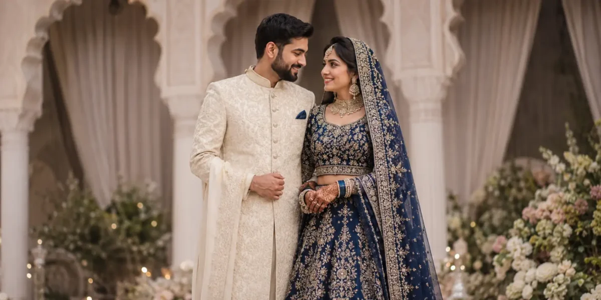
Matching your partner’s sherwani exactly can make wedding photos feel too coordinated.
Complementing usually works better.
If you are wearing midnight blue, your partner could wear beige, champagne, ivory, or muted gold with a small blue detail.
If your lehenga is sage green, ivory or warm beige can sit naturally beside it.
The aim is to make both outfits look like they belong in the same wedding, not like they came as a matching set.
Build a Color Story Across Your Wedding Events

You do not need to squeeze every color you love into your wedding lehenga.
Spread them across your events.
Your mehendi can be playful and bright.
Your sangeet can go deeper and moodier.
Your wedding ceremony can then take whichever direction feels most like you.
For example:
Mehendi: Coral, bright pink, marigold, lime, or playful multicolor.
Sangeet: Wine, plum, midnight blue, emerald, or deeper metallic tones.
Wedding ceremony: Ivory, sage, dusty rose, maroon, red, or whichever shade fits your setting and personal style.
The colors do not need to match across all three events.
They simply need to feel intentional.
Use Trend Reports as Inspiration, Not Permission
Pantone publishes seasonal Fashion Color Trend Reports based on runway color direction, including Spring/Summer 2026 and Autumn/Winter 2026–27 reports.
They can be useful when you are building a mood board or searching for interesting color families.
But do not choose a bridal lehenga simply because a shade appears in a forecast.
Your wedding photographs will last much longer than a fashion season.
Use trend reports to discover colors.
Designer Spotlight: What Top Bridal Labels Tell Us About Color in 2026
Trends are useful, but designer collections tell you something even more important: how those colors are actually being worn.
Is a deep shade being softened with organza? Is ivory being treated as bridal rather than reception only? Is traditional red disappearing, or simply being styled differently?
Looking at current collections from Manish Malhotra, Anita Dongre, and Sabyasachi gives us a clearer picture.
And no, all three designers are not telling brides to wear the same color.
That is good news.
Manish Malhotra: Strong Color Does Not Have to Feel Heavy

If you love dramatic color but worry about looking weighed down, take a cue from Manish Malhotra’s approach.
His current bridal offering includes rich blue alongside airy fabrics, including blue tulle and electric blue organza. The collection also uses ivory organza, tulle, sequins, pearls, and lighter draped elements alongside traditional bridal reds.
The key takeaway: A strong color does not require a heavy fabric.
You can wear:
- Sapphire blue
- Emerald
- Deep plum
- Other saturated jewel tones
And still keep the outfit fresh by choosing organza, tulle, net, or a lighter drape.
This works especially well for brides who love jewel tones but are getting married somewhere warm or simply do not enjoy the weight of velvet and dense silk.
You can also break up a deep color instead of wearing it head to toe.
For example:
- Rich blue skirt + ivory blouse
- Rich blue skirt + blush blouse
- Rich blue skirt + softly metallic blouse
Styling tip: If the skirt is very saturated, try your blouse and dupatta in slightly softer shades before automatically matching everything. That small break in color can make the entire outfit feel more modern.
Anita Dongre: Let Craft Guide the Color Story

If sustainability matters to you, look beyond the name of the color.
Ask how the fabric was made, dyed, woven, and embroidered too.
Anita Dongre’s sustainability work focuses on supporting crafts, rural women, and artisan communities. Her handcrafted products use natural fibres and a mix of vegetable and commercial dyes, with the aim of reducing environmental impact while maintaining color performance.
That makes this a useful reminder for brides who want their wedding outfit to reflect more than a Pinterest palette.
Your:
- Perfect green could come through handwoven fabric.
- Blue may come through an Ajrakh-inspired textile.
- Ivory outfit may become far more interesting when the craft itself is allowed to stand out.
Her current assortment also includes wedding and occasion pieces in shades such as ivory and sage, showing how softer earthy colors can fit naturally into contemporary Indian occasion wear.
What This Means for Your Bridal Lehenga
If you are drawn to earthy, natural colors, do not only ask your designer, “What shade is this?”
Also ask:
- Is the fabric handwoven?
- What dye process is being used?
- Will small color variations occur?
- How will the color age?
- Which craft or embroidery technique is used?
- Can I see the fabric in natural light?
Handcrafted textiles can have slight changes in texture, tone, and finish. That is not necessarily a flaw. In many craft-based fabrics, those differences are part of what gives the piece character.
Expert tip: If sustainability is important to you, ask specific questions rather than relying on broad words such as “eco-friendly” or “conscious.” Fabric, dye, craft, production, and longevity all matter.
Sabyasachi: Red Is Still Very Much Bridal

If everyone around you is talking about sage, lavender, and ivory, you might start wondering whether wearing red suddenly feels outdated.
It does not.
Sabyasachi’s Heritage Weddings direction describes red as an iconic bridal choice, and its current bridal direction continues to centre traditional Indian craft through materials and techniques such as matka silk, organza, velvet, brocade, zardozi, tilla, and gota.
So if red feels like you, keep it.
The more interesting decision is which red.
Instead of stopping at “bridal red,” consider:
- Deep maroon
- Brick red
- Wine red
- Scarlet
- Ruby
- Rust-red
- Muted crimson
- Deep red with antique gold
Each creates a completely different mood.
How to Make Red Feel More Personal
You do not need to reinvent the color. Change the texture and styling.
For example:
- Red organza → lighter and airier
- Red velvet → richer and more traditional
- Antique gold → heritage feel
- Tone-on-tone embroidery → more understated
- Ivory or muted pink dupatta → softer overall look
Even current Manish Malhotra bridal styles show how red can work across different fabric treatments.
The lesson: Tradition and personal style do not have to compete.
Find Your Bridal Color: A Quick Lehenga Personality Quiz
One Final Bridal Stylist Tip
When two colors both look beautiful, stop asking everyone in the room which one they prefer.
Look at yourself.
Which color makes you stand a little taller?
Which one makes you smile before anyone compliments you?
That is usually your answer.
Last updated: August 13, 2026.
This guide should be reviewed as designer collections and bridal color directions change, while the practical advice on skin tone, fabric, lighting, and styling remains useful beyond a single fashion season.